Customising the Dashboard
The dashboard is the heart of Metorik. It's the first page you see when visiting the app and the place you go for a quick overview of your store's metrics.
Dates
Up in the top right area of the page, you can change the current date period to look at:
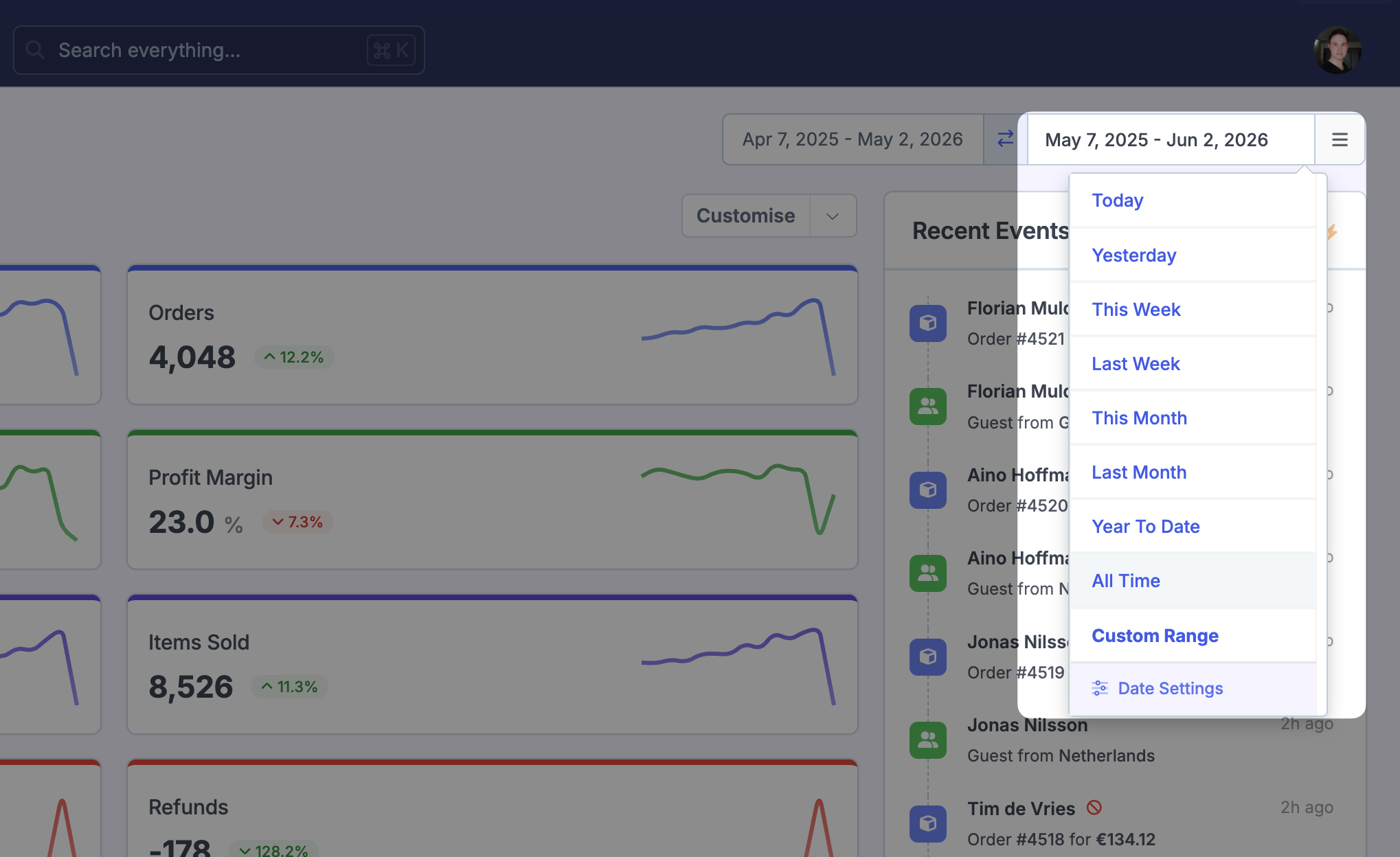
You'll find a variety of date ranges to pick from (you can enable other ones from the report settings page if you're a store admin) and can also choose a custom period.
To the left of that, you'll find the comparison date period:
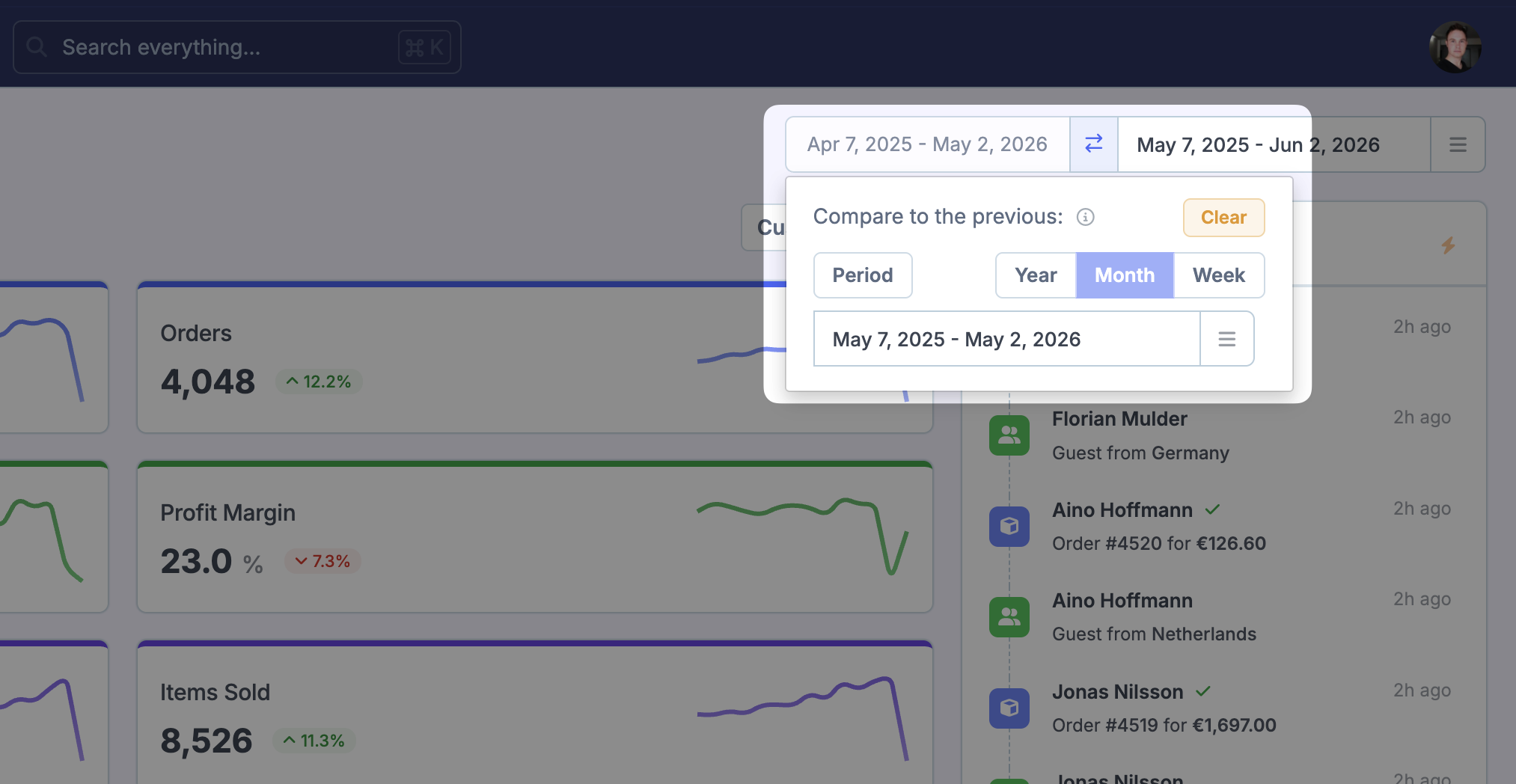
By default, it will compare the current date period to the previous period - more on period comparisons here.
Layouts
As you may have seen, Metorik includes a few pre-built layouts, as well as the ability to create your own layouts.
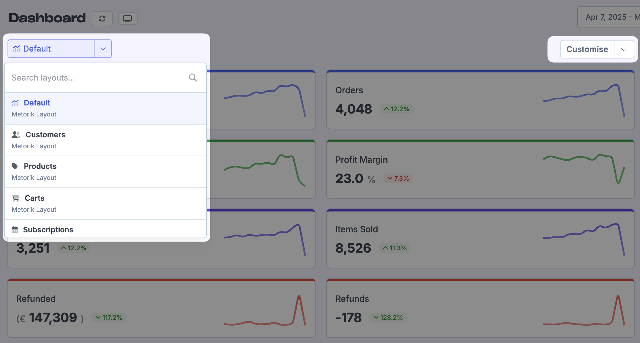
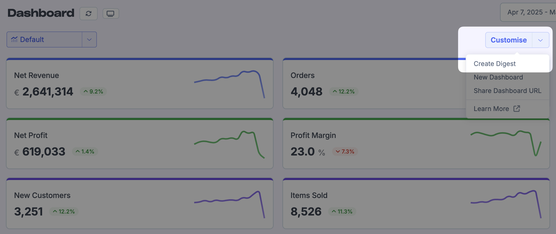
To get started customising a layout, click the customise button to the right:
That will open up an area where you can give the layout a name, and also choose if the layout should be shared with the whole team or just be accessible to yourself. You can also enable the Full Page setting to make the dashboard take up the whole page (the events area will be hidden).
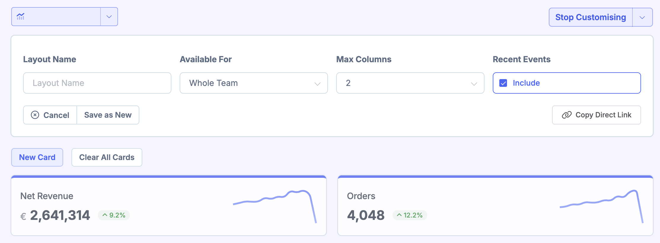
Additionally, you can click the Copy Share URL button to copy a shareable URL to your clipboard. When a member of your team goes to that URL, the layout will be selected for them.
If you'd like to create a digest based off a dashboard layout, you can click the customise dropdown and select Create Digest.
Now that you're editing the layout, you'll find Edit and Delete buttons on every card in the layout. You can also drag a card to change the ordering of them:
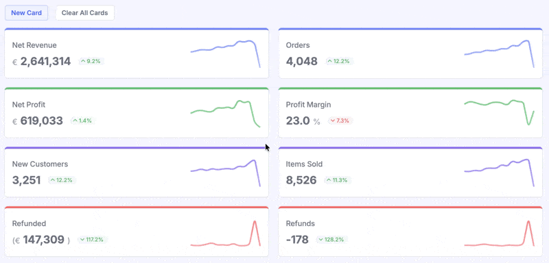
To add a new card, scroll down to the bottom of the dashboard and click the New Card box:
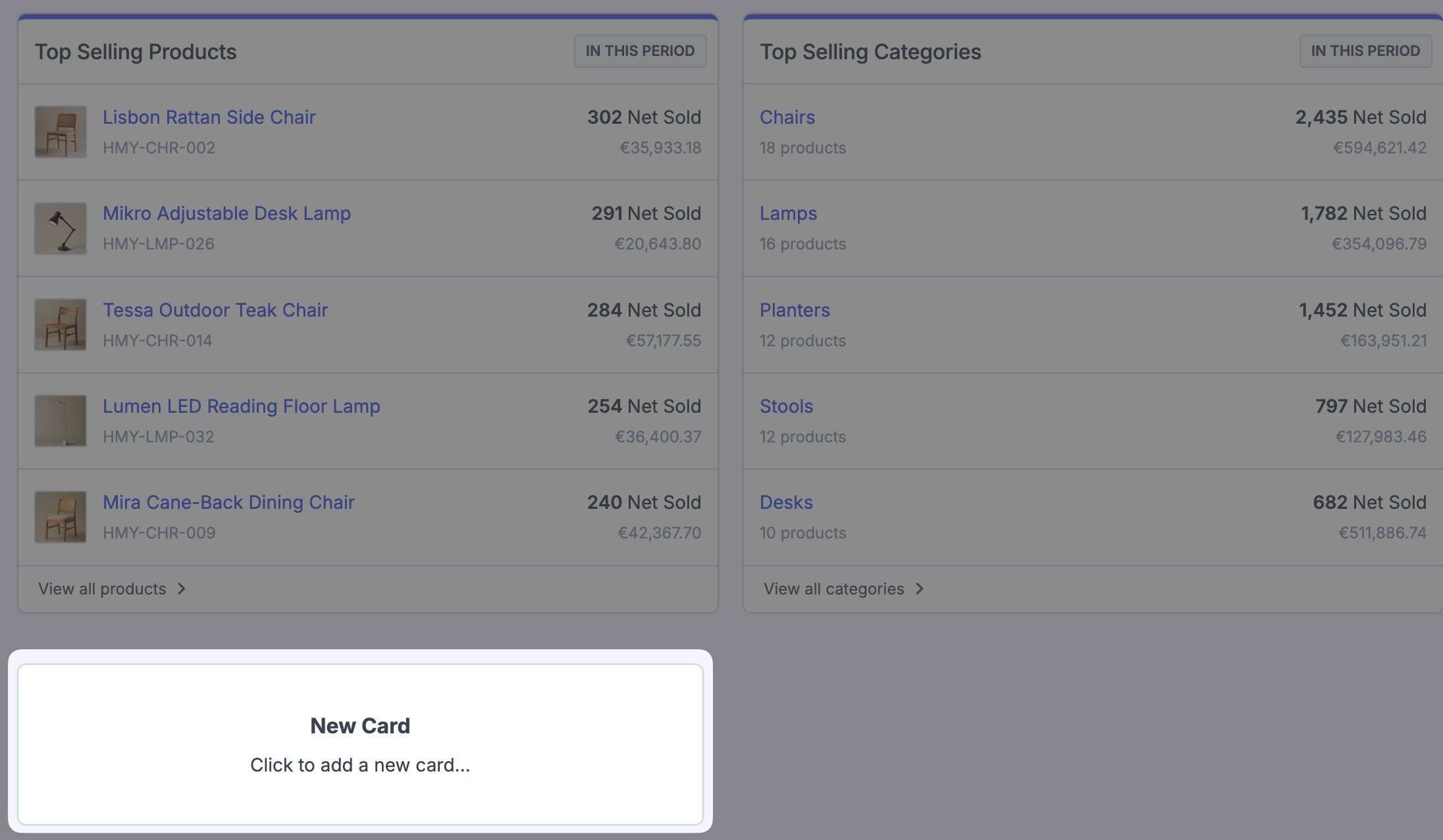
You'll be presented with a new dialog that allows you to build the card:
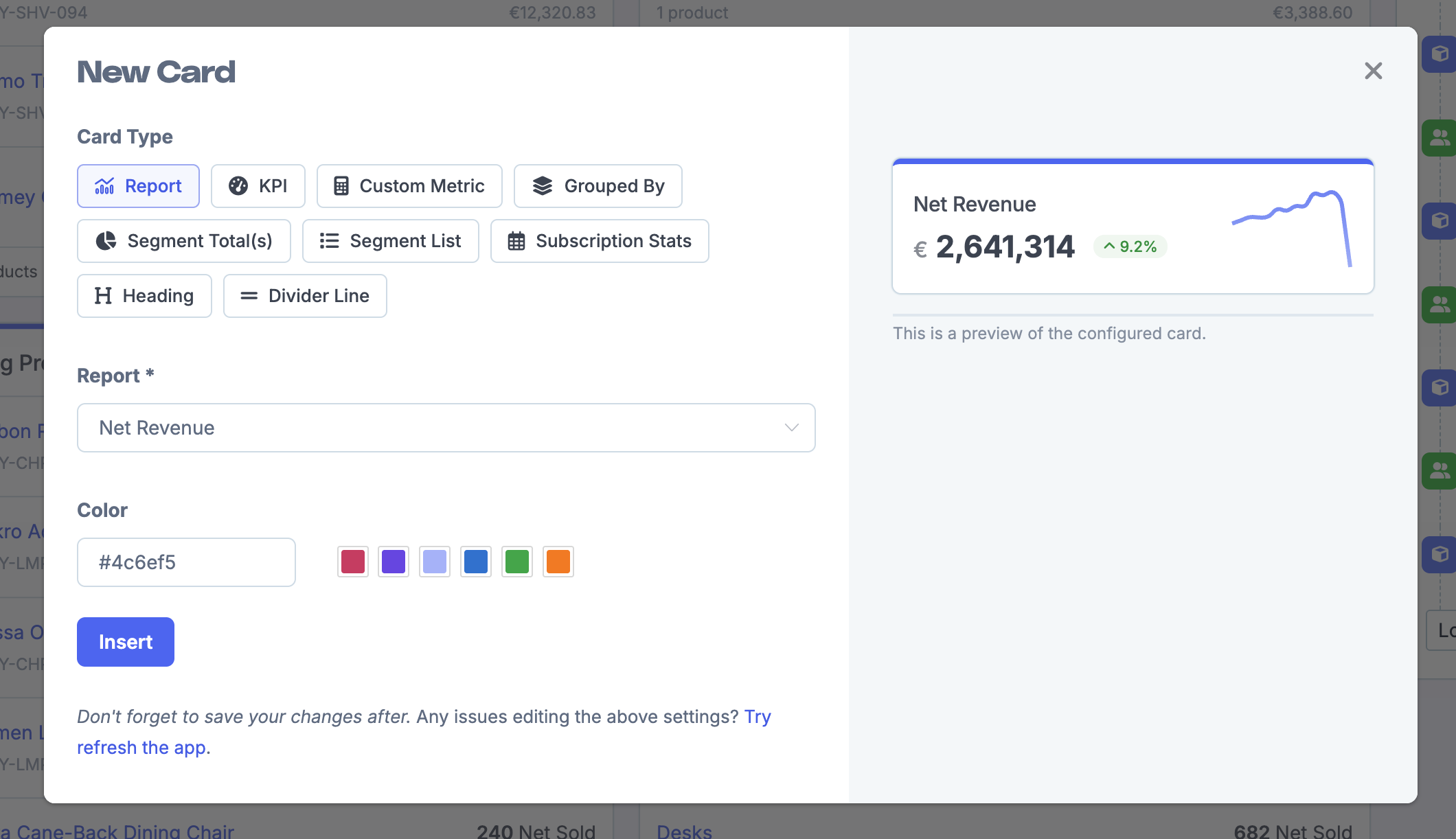
Choose a Card Type
Select the type of card you want to add:
Report — Display any report as a card with a chart and value
KPI — Show a single metric with optional comparison
Custom Metric — Build your own metric from scratch. Learn more about custom metrics.
Grouped By — Show data grouped by a dimension (e.g., orders by country)
Segment Total(s) — Display counts or values from a saved segment. Learn how to add a custom segment to the dashboard.
Segment List — Show a list of items from a saved segment. Learn how to add a custom segment to the dashboard.
Subscription Stats — Subscription-specific metrics (for stores with subscriptions)
Heading — Add a section heading to organize your dashboard
Divider Line — Add a visual separator between cards
Configure the Card
Depending on the card type, you'll see different configuration options:
Report — Choose the report to display from the dropdown (e.g., Net Revenue, Orders, Customers)
KPI — Select the metric, date range, and comparison period
Segment cards — Pick from your saved segments
Set the Card Color
Choose a color for your card. You can pick from the preset swatches or enter a custom hex color code to match your brand or organize cards visually by category.
Preview and Insert
A preview on the right shows how your card will look with the current settings. When you're happy with the configuration, click Insert to add the card to your dashboard.
Don't forget to save your layout changes after adding or editing cards. Click the Save button in the layout editor to preserve your changes.
Sharing dashboards
You can share a dashboard with people outside your team using dashboard viewers. This gives them read-only access to a specific dashboard without full store access. Learn about sharing dashboards with dashboard viewers.