
Using the Compare Customers report
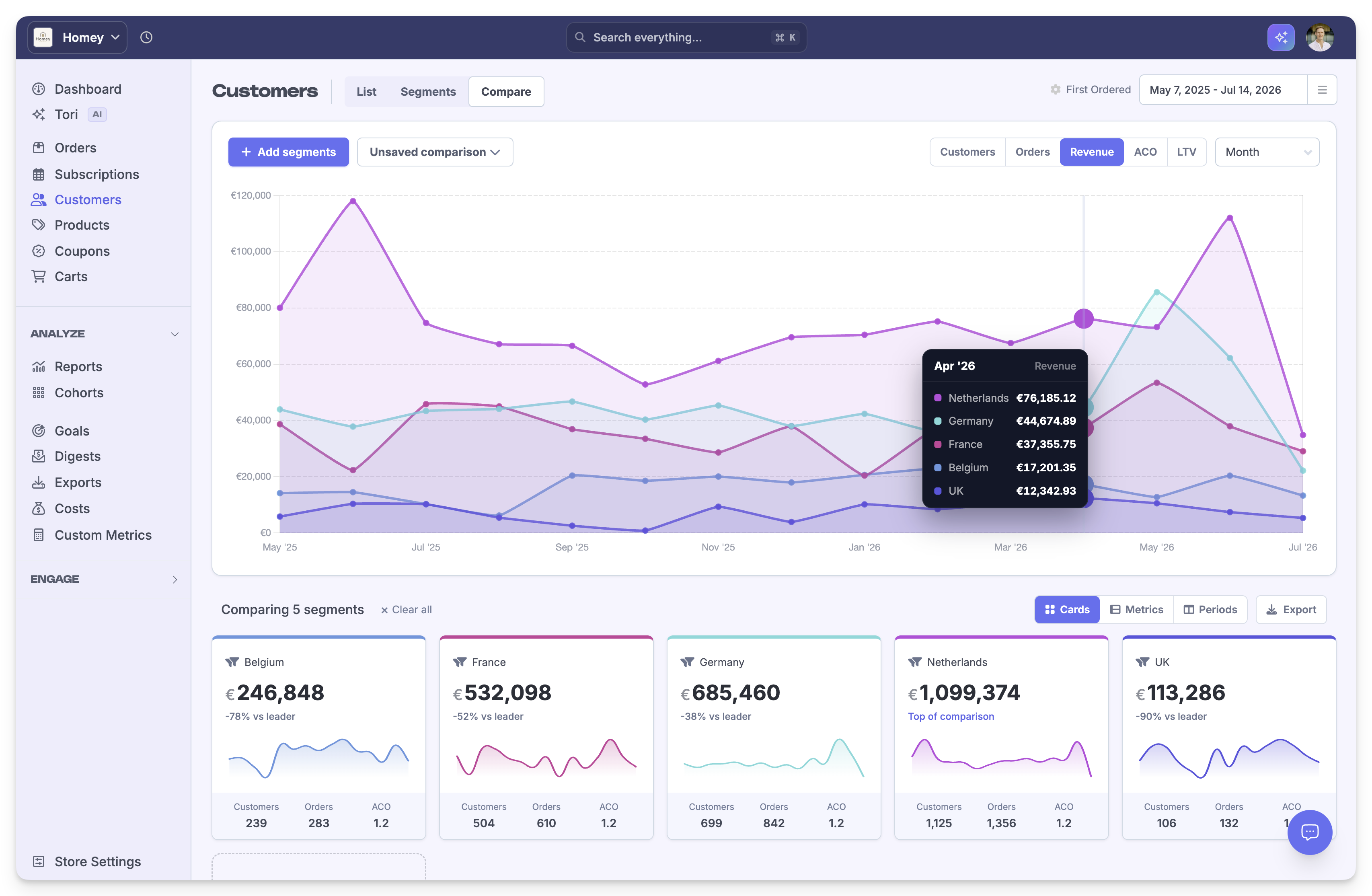
The Compare Customers report lets you compare customer segments side by side to analyze metrics like Customers, Orders, Revenue, ACO, and LTV over time. Choose a date range, add segments, and switch between chart, cards, and metrics views.
How to compare customer segments
Open the Compare Customers report
Go to Customers and select the Compare tab, or navigate directly to the Customers Compare page.
Add customer segments
Click + Add segments and select the saved customer segments you want to compare. You can compare multiple segments in the same view.
Set the date range and metric
Use the date picker in the top right to choose the time period. Click a metric tab – such as Customers, Orders, Revenue, ACO, or LTV – to control what data appears in the chart and table.
Choose a time grouping
Use the granularity dropdown to group data by Day, Week, Month, Quarter, or Year.
View and analyze the comparison
Switch between view modes to see the data in different formats:
Cards: Summary cards with sparklines and key totals for each segment
Metrics: A table with totals for each segment
Periods: A breakdown by time period
Each card shows the segment’s performance relative to the leader in the comparison.
Export the comparison
Click the Export button to download the comparison data as a CSV file.
What's next
Learn about segmenting data to create custom customer segments
See Compare Periods to understand date-over-date comparisons
Related compare reports
Period limits
Each comparison is limited to a maximum of 120 periods. If your chosen date range exceeds this limit for the selected granularity – for example, more than three months of daily data or more than two years of weekly data – reduce the date range in the top right date picker. This keeps the report fast and responsive.